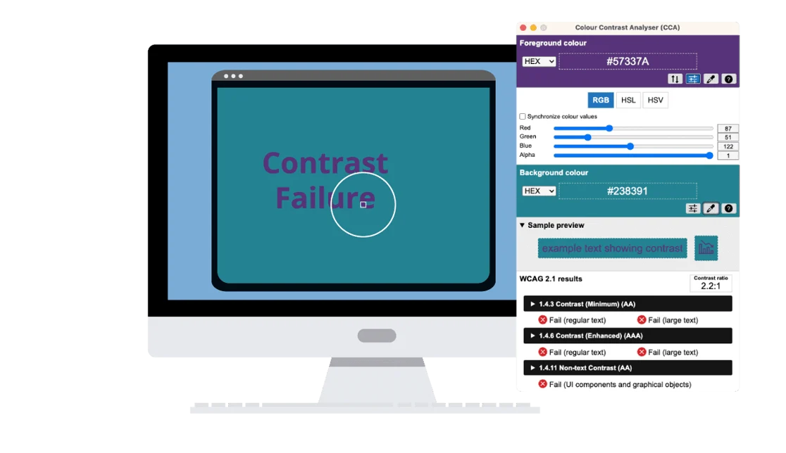
Color contrast is critical in your digital content because it ensures people with low vision, color blindness (approximately 1 in 12 men), or situational impairments (like screen glare) can easily read text on the screen. Ideally, the ratio between the text color and the background color should be 4.5 to 1, but what does that mean and how do you know whether you are using the right colors? The color contrast scale moves from 1:1 (white on white) to 21:1 (black on white). If you know the color codes, you can use an online tool to determine the contrast ratio. However, many people don’t know how to find the color codes, so a free tool like Colour Contrast Analyzer (CCA) can be a big help. After downloading this app for your Mac or PC, you can use the eye dropper tool to pick any colors on your screen to determine the contrast ratio.
Check it out here: Colour Contrast Analyzer